Case Study: Kafiex Coffee Roasters
The COVID-19 pandemic upended a lot of our daily lives when it hit in March: Our kids were sent home from school, we got to a first-name basis with our DoorDash drivers, we started calling sweatpants, “pants.”

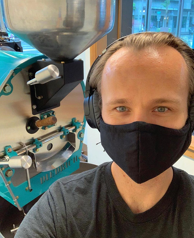
One thing it didn’t change? Our collective love of coffee. So when Kafiex (Cah-fay-ex) Roasters could no longer welcome guests to its Coffee Lab in downtown Vancouver this past spring, co-owners Seidy and Matthew Selivanow did the next best thing: They brought their award-winning cold brew coffee to the world. And they enlisted us to help.
Soon after COVID-19 forced the Kafiex closure, Seidy and Matthew approached us about designing labels for three cold brew cans they wanted to release: its original cold brew (which won the People’s Choice award at Cold Brew Fest in 2018), an Ethiopia cold brew, and an oat-milk latte.
Needless to say, we were as excited for the opportunity as we are to take our first sip of cold brew on Monday mornings.
Right away, we knew we had an audience to win over and please: A bold design might catch a shopper’s eye at the likes of New Seasons, but additional information and deeper context would set Kafiex apart from some of the bigger brands in the cold brew market. So we included thoughtful flavor descriptions and the Fair Trade Certified seal to help consumers make more informed choices.
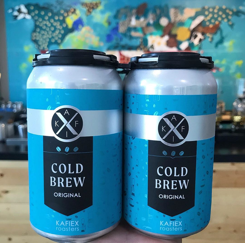
Our next opportunity was figuring out how to communicate that information through the prism of Kafiex’s playful brand. We opted for bold, bright colors—teal for the original cold brew can, and a deep blue for the Ethiopia can—and accented that with a metallic background pattern dotted with coffee beans, pots, and roasters. We rounded out each design with the Kafiex logo and a black flag on the front of the can, along with images of three coffee beans—the same coffee bean graphics you’d see in the Kafiex shop.

But describing what’s on the can only tells part of the story—a story that couldn’t be told without contributions from several team members at every stage of the design process. Our ace graphic designer Ashley Jhaveri brought together most of the graphical elements and came up with an easily identifiable template for the three cans, but Matthew at Kafiex designed the metallic pattern that appears on each label, and one of our social media marketing pros (Will Smith) suggested we add the three coffee beans to help tie the cans and shop together. (You’re never getting just one brain when teaming up with ZZeppelin; our whole team puts their heads together to give our clients the best possible experience on every project.)

The way it all came together, the cans made a bold statement at first glance, but rewarded a closer look and deeper analysis with subtler, more nuanced elements—not unlike the coffee inside. Seidy and Matthew loved the cans, and we hope you do, too, when they start showing up on grocery store shelves soon.
Want to learn more? The Columbian newspaper wrote about Kafiex’s cold brew cans, along with a few other coffee roasters who also launched cold brew cans.